


Note to the reader: This is the fourth in a series of articles I’m publishing here taken from my book, “Investing with the Trend.” Hopefully, you will find this content useful. Market myths are generally perpetuated by repetition, misleading symbolic connections, and the complete ignorance of facts. The world of finance is full of such tendencies, and here, you’ll see some examples. Please keep in mind that not all of these examples are totally misleading — they are sometimes valid — but have too many holes in them to be worthwhile as investment concepts. And not all are directly related to investing and finance. Enjoy! – Greg
The Deception of Average
The World of Finance is fraught with misleading information.
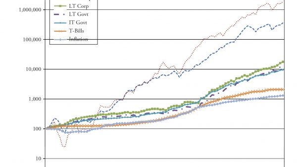
The use of averages, in particular, is something that requires discussion. Figure 4.1 shows the compounded rates of return for a variety of asset classes. If I were selling you a buy-and-hold strategy, or an index fund, I would love this chart. Looking at the 85 years of data shown here, I could say that, if you had invested in small-cap stocks, you would have averaged 11.95 percent a year, and if you had invested in large-cap stocks, you would have averaged 9.85 percent a year. And I would be correct.
Figure 4.1
I think that most investors have about 20 years, maybe 25 years, in which to accumulate their retirement wealth. In their 20s and 30s, it is difficult to put much money away for many reasons, such as low incomes, children, materialism, college, and so on. Therefore, with that information, what is wrong with this chart? It is for an 85-year investment, and people do not have 85 years to invest. As said earlier, most have about 20 years to acquire their retirement wealth. and there are many 20-year periods in this chart where the returns were horrible. The bear market that began in 1929 did not fully recover until 1954, a full 25 years later; 1966 took 16 years to recover, 1973 took 10 years, and, as of 2012, the 2000 bear still had not recovered.
Table 4.1 shows the performance numbers for the asset classes shown in Figure 4.1 (LT—Long Term, IT—Intermediate Term). The cumulative numbers in Table 4.1 begin at 1 on December 31, 1925.
Table 4.1Hint: Be careful when someone uses inappropriate averages; or more accurately, uses averages inappropriately.
In Table 4.1, recall how the small-cap and large-cap compounded returns were about 12 percent and 10 percent, respectively. Figure 4.2 shows rolling 10-year returns by range since 1900. A rolling return means it shows the periods 1900–1909, 1901–1910, 1902–1911, and so on. You can clearly see that the small stock and large stock returns depicted in Table 4.1 fall within the middle range (8 percent–12 percent) in Figure 4.2, yet, of all the 10-year rolling periods, only 22 percent of them were in that range. Often, average is not very average. It reminds me of the story of the six-foot-tall Texan that drowned while wading across a stream that averaged only three-feet deep.
Figure 4.2
Another (and final) example shows how easily it is to be confused over what is average. And, of course, this time it is intentional. This example should put it in perspective. You cannot relate rates of change linearly. In Figure 4.3 , point A is 20 miles from point B. If you drive 60 mph going from point A to point B, but returning from point B to point A, you drive 30 mph. What is his average speed for the time you were on the road?
A. 55 mph
B. 50 mph
C. 45 mph
D. 40 mph
Figure 4.3
Many will answer that it is 45 mph ((60mph + 30mph)/2). However, you cannot average rates of change like you can constants and linear relationships. Distance is rate multiplied by time (d = rt). So time (t) is distance (d)/rate (r). The first leg from A to B was 20 miles divided by 60 mph or one-third of an hour. The second leg from B to A was 20 miles divided by 30 mph or two-thirds of an hour. Adding the two times (1/3+2/3 = 1 hour) will mean you traveled for one hour and covered a total distance of 40 miles, which has to mean the average speed was 40mph. Look up harmonic mean if you want more information on this, as it is the correct method to determine central tendency of data when it is in the form of a ratio or rate.
Figure 4.4 shows the 20-year rolling price returns for the Dow Industrials. The range of returns in this 127-year sample (1885–2012) is from a low on 08/31/1949 (of .3.71) percent to a high on 3/31/2000 (of 14.06 percent), a 17.77 percent range.
To help clarify rolling returns, if investors were in the Dow Industrials from 9/30/1929 until 8/31/1949 (the low mentioned previously), they had a return of .3.71 percent. Complementary, if they invested on 4/30/1980, then, on 3/31/2000, they had a return of 14.06 percent. The mean return is 5.2 percent and the median return 4.8 percent. When median is less than mean, it simply means more returns were less average. If you recall the long-term assumptions that are often used in the first part of this chapter (Figure 4.1), you can see there is a problem. The magnitude of errors in assumptions of long-term returns cannot be overstated and certainly cannot be ignored. This variability of returns can mean totally different retirement environments for investors who use these long-term assumptions for future returns. It can be the difference between living like a king, or living on government assistance. Institutional investors have the same problems if using these long-term averages.
Figure 4.4
One of the primary beliefs developed by Markowitz in the 1950s as the architect of Modern Portfolio Theory was the details on the inputs for the efficient investment portfolio. In fact, his focus was hardly on the inputs at all. The inputs that are needed are expected future returns, volatility, and correlations. The industry as a whole took the easy approach to solving this by utilizing long-term averages for the inputs — in other words, one full swing through all the data that was available, and the average is the one used for the inputs into an otherwise fairly good theory. Those long-term inputs are totally inappropriate for the investing horizon of most investors; in fact, I think they are inappropriate for all human beings. While delving into this deeper is not the subject of this book, it once again brings to light the horrible misuse of average. These inputs should use averages appropriate for the investor’s accumulation time frame.
One If by Land, Two If by Sea
Sam Savage is a consulting professor of management science and engineering at Stanford University, and a fellow of the Judge Business School at the University of Cambridge. He wrote an insightful book, The Flaw of Averages, in 2009, wherein he included a short piece called “The Red Coats” that fits right into this chapter.
Spring 1775: The colonists are concerned about British plans to raid Lexington and Concord, Massachusetts. Patriots in Boston develop a plan that explicitly takes a range of uncertainties into account: The British will come either by land or by sea. These unsung pioneers of modern decision analysis did it just right by explicitly planning for both contingencies. Had Paul Revere and the Minutemen planned for the single average scenario of the British walking up the beach with one foot on the land and one in the sea, the citizens of North America might speak with different accents today.
Incidentally, Dr. Savage’s father, Leonard J. Savage, wrote the seminal The Foundation of Statistics in 1972 and was a prominent mathematical statistician who collaborated closely with Milton Friedman.
Everything on Four Legs Is a Pig
Although this is unrelated to investments and finance, it is a story about averages that offers additional support to this topic. Doctors use growth charts (height and weight tables) for a guide on the growth of a child. What folks do not realize is that they were created by actuaries for insurance companies and not doctors. As doctors began to use them, the terms overweight, underweight, obese, and so on were created based on average. So if your doctor says you are overweight and you need to lose weight, he is also saying you need to lose weight to be average. And from a Wall Street Journal article by Melinda Beck on July 24, 2012, “The wide variations are due in part to rising obesity rates, an increase in premature infants who survive, and a population that is growing more diverse. Yet the official growth charts from the Centers for Disease Control (CDC) and Prevention still reflect the size distribution of U.S. children in the 1960s, 1970s, and 1980s. The CDC says it doesn’t plan to adjust its charts because it doesn’t want the ever-more-obese population to become the new norm.” And now you know.
During my last physical examination, I told my doctor about how these charts on height and weight were just large averages created by actuaries for insurance companies, and that I did not mind being above average. The chapter that follows focuses on the multibillion-dollar industry of prediction. I rarely am invited to be on the financial media anymore because I refuse to make a prediction; it is a fool’s game.
Thanks for reading this far. I intend to publish one article in this series every week. Can’t wait? The book is for sale here.